Understanding Outliers — The “Special Cases” in Your Data
Concept and Significance of Outliers
An outlier is an observation in a dataset that significantly deviates from other data points. These anomalies can appear in numerical, categorical, or time series data. In statistics, the presence of outliers can greatly affect measures like the mean, standard deviation, and regression coefficients, causing results to deviate from the true trend. Outliers are not only “exceptions” but can also provide important insights. For example, in industrial production, abnormal sensor readings may indicate equipment failure; in financial data, unusual transactions may signal fraud. Analysts need to distinguish between erroneous data and genuinely informative anomalies to make informed decisions in data cleaning, modeling, or business strategies.
In data science, handling outliers is crucial for model performance. In supervised learning, unhandled outliers may cause overfitting or make the model sensitive to extreme values. In unsupervised learning, outlier analysis can itself be a primary goal, such as detecting credit card fraud or identifying unusual medical conditions.
Methods for Identifying Outliers
Methods for detecting outliers can be categorized into statistical approaches, model-based approaches, and visualization techniques. Statistical methods typically measure how far a data point deviates from the overall distribution, such as using standard deviation or the interquartile range (IQR) to determine if a value falls outside a reasonable range. Model-based methods involve building predictive models and identifying points that deviate from expected predictions, such as residual analysis in regression or density estimation. Visualization methods offer an intuitive way to observe data distributions and anomalies using scatter plots, boxplots, histograms, and more.
Different methods are suitable for different data types and analysis goals. For single-variable continuous data, statistical methods and boxplots are commonly used; for multivariate or high-dimensional data, model-based approaches or clustering-based anomaly detection are more appropriate. Detecting outliers is not only about spotting anomalies but also understanding the data structure and underlying patterns.
Strategies for Handling Outliers
Once outliers are identified, analysts must decide how to handle them. The strategy depends on the source of the outlier and the analysis goal. If an outlier is due to a data entry or measurement error, it is usually cleaned or corrected to prevent bias. If an outlier is a legitimate extreme value, it may be retained, transformed, or analyzed separately depending on the purpose. In some cases, outliers provide key business insights, such as unusual orders or exceptionally high performance.
During modeling, robust statistical methods can reduce the impact of outliers, such as using the median instead of the mean or applying robust regression. In exploratory data analysis and visualization, labeling and grouping outliers helps analysts better understand the overall distribution while preventing single extreme points from distorting trends.
Boxplot: A Visual Tool for Outliers
A boxplot is a visual tool that displays the distribution of data and highlights outliers. The box represents the median, the first quartile (Q1), and the third quartile (Q3). “Whiskers” extend from the box to show the range of typical values. The calculation is as follows:
First, compute the interquartile range (IQR) as IQR = Q3 − Q1. The lower bound of the whisker is Q1 − 1.5 × IQR, and the upper bound is Q3 + 1.5 × IQR. Any data point outside these bounds is considered an outlier.
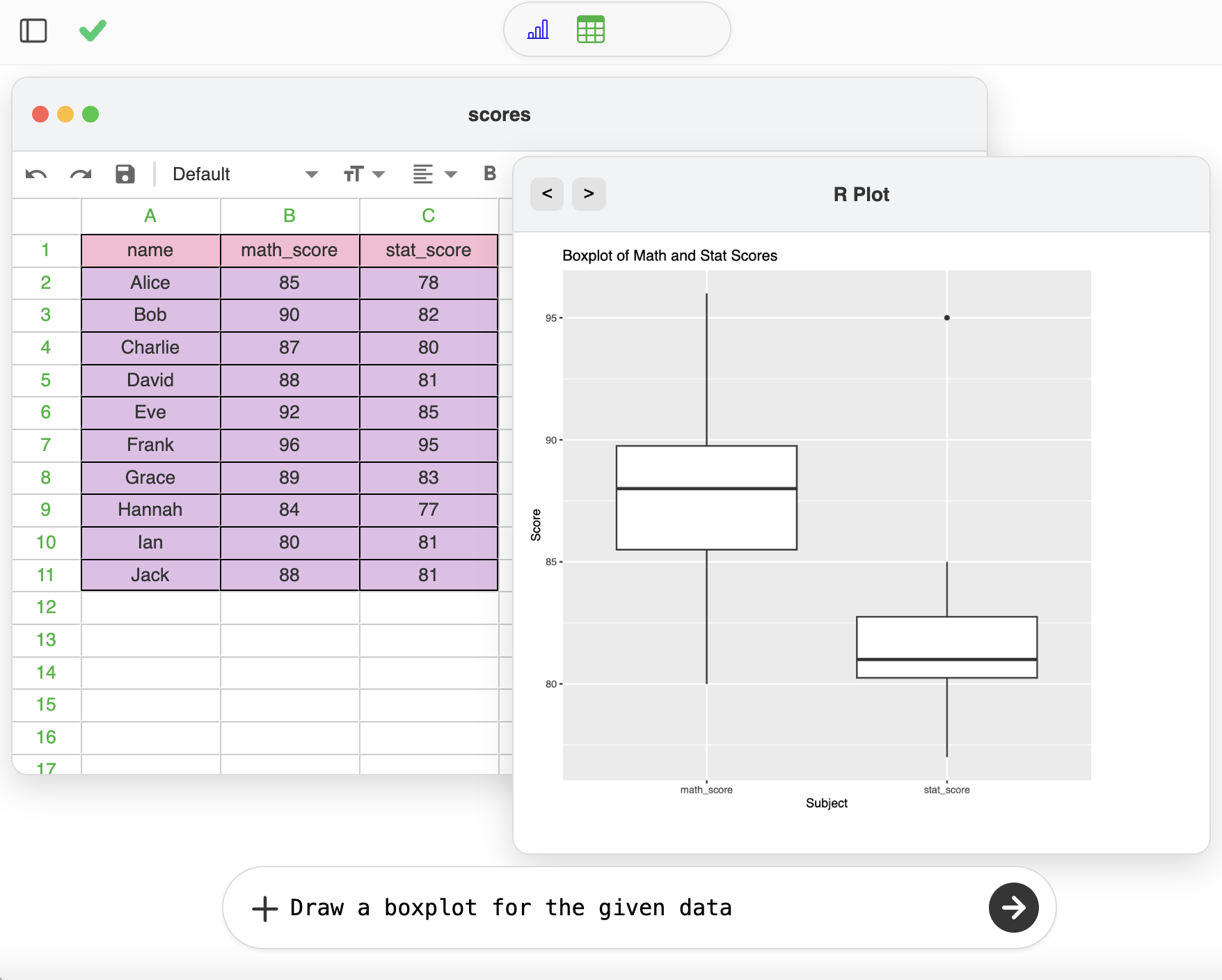
Boxplots allow analysts to quickly see whether data is concentrated, symmetric, or contains extreme points. For multiple variables, such as math_score and stat_score, the boxplot can be calculated for each column separately to detect outliers in each metric. This method provides an intuitive way to understand data structure and identify anomalies.
Real Data Example
To better understand outliers, here is a table of student scores including both math and statistics scores:
| Name | Math Score (math_score) | Statistics Score (stat_score) |
|---|---|---|
| Alice | 85 | 78 |
| Bob | 90 | 82 |
| Charlie | 87 | 80 |
| David | 88 | 81 |
| Eve | 92 | 85 |
| Frank | 96 | 95 |
| Grace | 89 | 83 |
| Hannah | 84 | 77 |
| Ian | 80 | 81 |
| Jack | 88 | 81 |