How to Create a City-Level Consumption Chart in ggplot (Osaka Example)
This is a very common situation in real analysis work. You receive consumption data for multiple cities or districts, and you want to understand how spending patterns differ across regions.
A typical question looks like this: “Plot entertainment spending across different districts in Osaka using a map.”
This kind of question appears frequently in urban studies, retail analysis, regional economics, and internal business reviews.
Sample data:
| City | Food Spend | Transport Spend | Entertainment Spend |
|---|---|---|---|
| Osaka City | 1200 | 450 | 600 |
| Sakai | 900 | 320 | 410 |
| Higashiosaka | 780 | 290 | 350 |
In traditional Excel workflows, this usually means: selecting ranges, reshaping the data, trying different chart types, adjusting colors, fixing labels, and repeating the same process every week when new data arrives.
With SheetAI, the process is very different. You describe the intent: “Create a city-level consumption comparison chart for Osaka.”
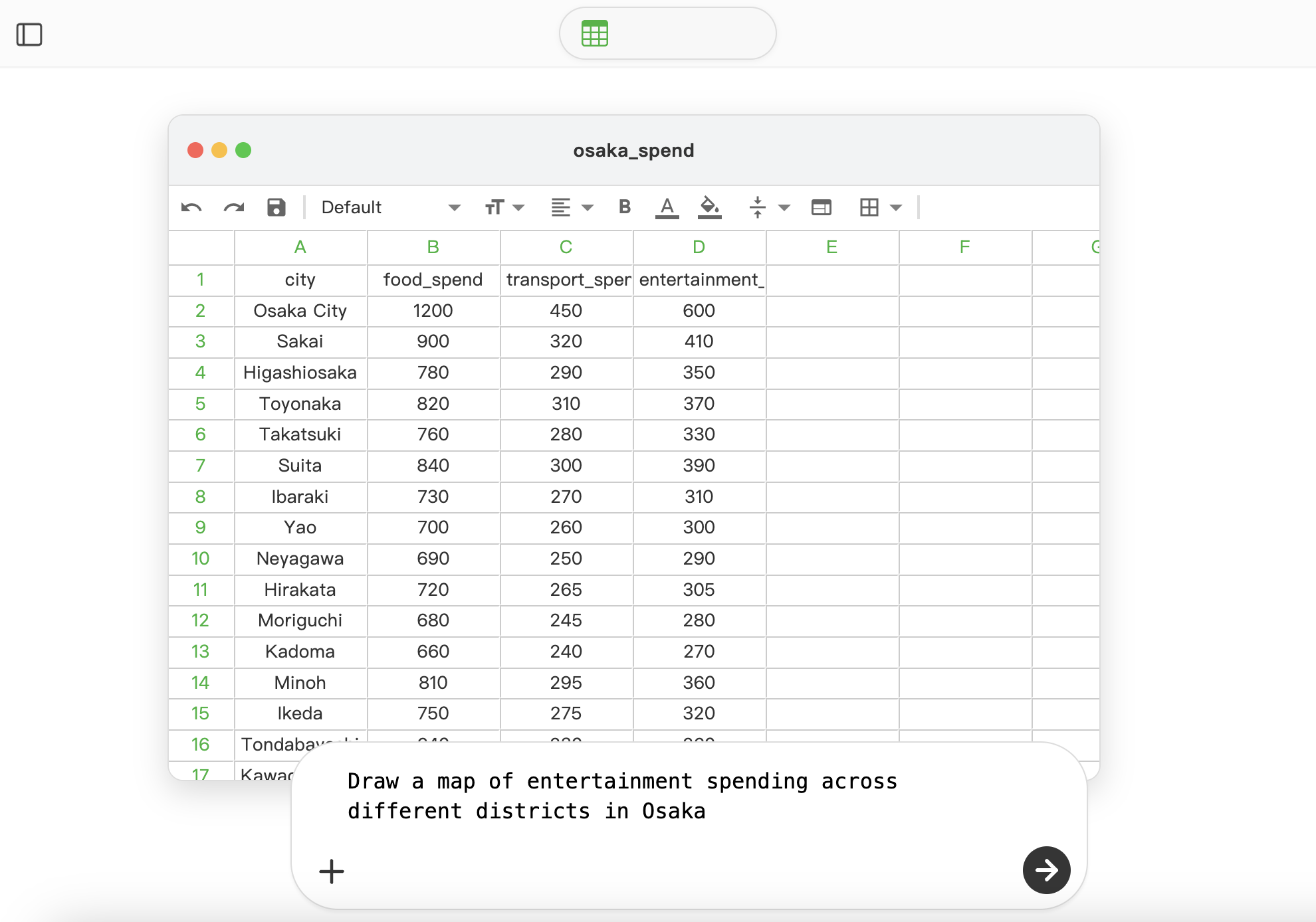
The AI interprets the structure of the data, selects an appropriate visualization approach, and generates the chart automatically using ggplot.
The resulting chart is not just functional. It follows clean visual principles: balanced layout, readable typography, and a restrained, elegant color palette.
The colors are chosen to emphasize differences without overwhelming the viewer, making the chart suitable not only for internal analysis, but also for presentations, reports, or publication-level outputs.

You can view a shared example of the generated visualization here: